Replay records software so you can play it back later, which means you spend a lot of time navigating video through a timeline. But as we’ve learned from YouTube, it can be hard finding one key moment in a long video. For example, here’s David Byrne dancing with a lamp during the best concert film of all time. I focused the share link there so you don’t need to hunt through nearly two hours of rad early-80s content to find it. You’re welcome!
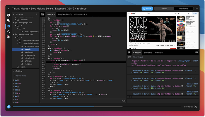
The Replay UI (dark theme is coming soon, shh!)
The problem we set out to solve
Watching vintage YouTube concert videos is one thing, but what about navigating through software? Any developer will tell you that debugging too often feels like finding a needle in a haystack and the haystack is on fire and you’re on fire and everything is on fire because you’re in hell. So we’ve been working on the technology to focus replays to a window of time to help make life easier. We call it Focus Mode.
The goal is “of course”
There are a lot of technical details and considerations listed below, but our end goal is always “of course.” The end-user shouldn’t marvel at all the complexity because they shouldn’t notice it. Like a well-done soundtrack, this UX should do its dang job without drawing attention to itself.
But that doesn’t mean it was easy! Here are the details we worked through on our journey to an “of course” design.
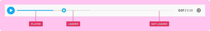
1. Here’s our standard timeline in light theme
We start with a pretty standard pattern. The only tricky part is the slightly darker grey that shows how far we’ve buffered. YouTube does this too.
2. Unloaded states
Our first curveball! In some rare cases, a video might be so long that we need to unload portions of it. How can we show a user that the video is available but telegraph that there could be a delay? (#jealous that YouTube doesn’t have to deal with this) Here’s what we came up with — a dotted line:
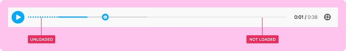
An important nuance to understand is that this is not something the user opts into. It’s something that happens to them sometimes, like an error page. So it’s important to handle it carefully. We don’t want to over-message it with annoying dialogs, but we don’t want to under-message it and cause confusion if things take a while to load. I’m skipping over lots of details, but we fussed over this and found a good balance.
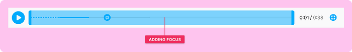
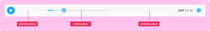
3. Setting a focus window
This is where things get spicy, so we message it with an instructional prompt (not shown) and keep the wayfinding strong by keeping the interface the same with one important detail: we overlay a new focus component with draggable edges.
This is a whole new design pattern to figure out, so even though this is an opt-in professional-grade feature, we need to take care to make things as clear as possible. It’s getting tough, though! To use a juggling metaphor, we’ve gone from handling three oranges of complexity to seven grapefruits. But at least we’re not juggling metaphorical UX swords.
Yet.
4. Shrinking the focus window
I love this screen, because it’s designed to feel obvious even though there’s a ton going on behind the scenes. Soak it in and I’ll explain why it’s cool.

Do you see how we’re re-using the blue dotted line on the left? We’re pulling a fast one here because we’re re-using the visual language in two different contexts. Oo, sneaky.
We considered using different visuals for “things that unloaded because of user action” and “things that unloaded because of something behind-the-scenes” but why bother? All the user needs to know is “dotted line means it’s not available.”
Mental models are important to get right, and sometimes it means fudging some of the pedantic “well actually” backend details to keep things clear and focused on the end goal. (Classic JTBD amirite) That’s what we did here, but if you blink you’ll miss it. I love UX details like that.
4. “Focus mode, engage!”
In this view, the user is done focusing and wants to get back to the work of debugging. They’re returned to the same timeline they’re used to seeing, but now the details outside the focus area are faded back significantly.
At this point, you can’t access anything outside of Focus Mode. We supress console evals, ignore events, stop the video playback, and do a lot of other housekeeping and due dilligence to make sure everything feels right. (We had a version where you could play video even when it’s outside the focus window, but it felt broken in testing. Fixed! Onward!)
So is that it? Well, no. Much like a Stephen King baddie who always staggers back even when you thought he was defeated, we realised late in our process there was another edgecase we needed to solve for. What happens when you expand the focus window? How do you show the resulting loading states?
Hang onto your hats, y’all.
5. OMG WTF BBQ
Looking at this visual, you’d be excused for thinking we’re not very good at this whole product design thing. But bear with me, there’s some brilliant work going on here, even though I accept that it looks overly complicated and designed by a stupid person. Hang tight.
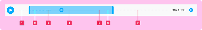
- 1 and 7 will never load because they’re outside the focus window
- 2 will load, but it’s gonna take a second, hold your horses pls
- 3 is hot to trot, gosh I’m really going for a horse theme here
- 4 is our standard buffered view, so if you hit play, this area will work
- 5 is a cousin to 2, it’ll be ready soon
- 6 is a lot like 5, but we need it to look different because it was previously outside the focus window, and that’s important info, can ya dig it?
So yeah. There’s a lot going on there. But remove any one of those styles and something else in the UX suffers. For example, we could make 5, 2, and 6 look the same, but then we lose context when resizing.
But it’s ok little chickens, all the complexity goes away once everything is loaded down there on screen #7. But first we need to handle some more loading states.
6. Re-hydrating our focus mode

This is an interesting view because we’re showing a loading state in two different ways. If I were in a design critique, my fellow designers would challenge this and ask if there’s a way to use the same visual language for both. It’s a good question! We worked through it, and the answer we came to was a resounding “nope!” Not without making some design trade-offs that cause other issues, similar to the ones described above.
But of course this is a short-term state. Our servers load things pretty fast, which brings us back to…
7. Done loading

And here’s our standard focused state. Pretty clear, despite all the crazy contortions we had to do in the code to get here. Then when you stop needing focus mode, you can go back to the standard timeline. Voila!
Baby steps
This is a brand-new bouncing baby feature. Just like a real-life human baby, it’s cute and simple but now it’s up to us to make sure it grows up to be awesome. There are going to be lots of twists and turns along the way, and that’s the fun part. Let us know if you have any feedback by joining our Discord. We’d love to chat about this more to make it even better!
Bonus content
Here’s a one minute video demo of me geeking out about this feature.