I love writing detailed explanations of product design. You might have seen my Design Explosions series, where I wrote 10,000 words comparing Apple Maps and Google Maps. Today I’d like to aim some of that energy towards the design my team and I have been working on for the last year at http://replay.io. But maybe a bit shorter and easier to read :)
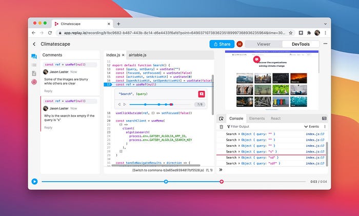
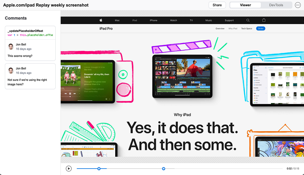
Here’s how our product looks today, as a reference point:
What Replay does
Replay is a “time travel debugger,” meaning it can record websites to help you fix bugs. A successful design will allow anyone on a software team — engineer, product manager, tester, designer, executive — to collaborate on bugs and fix them much faster.
The pieces we started with
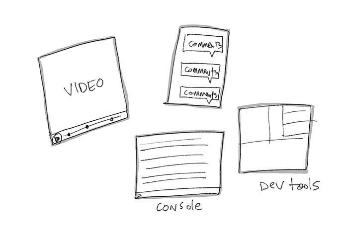
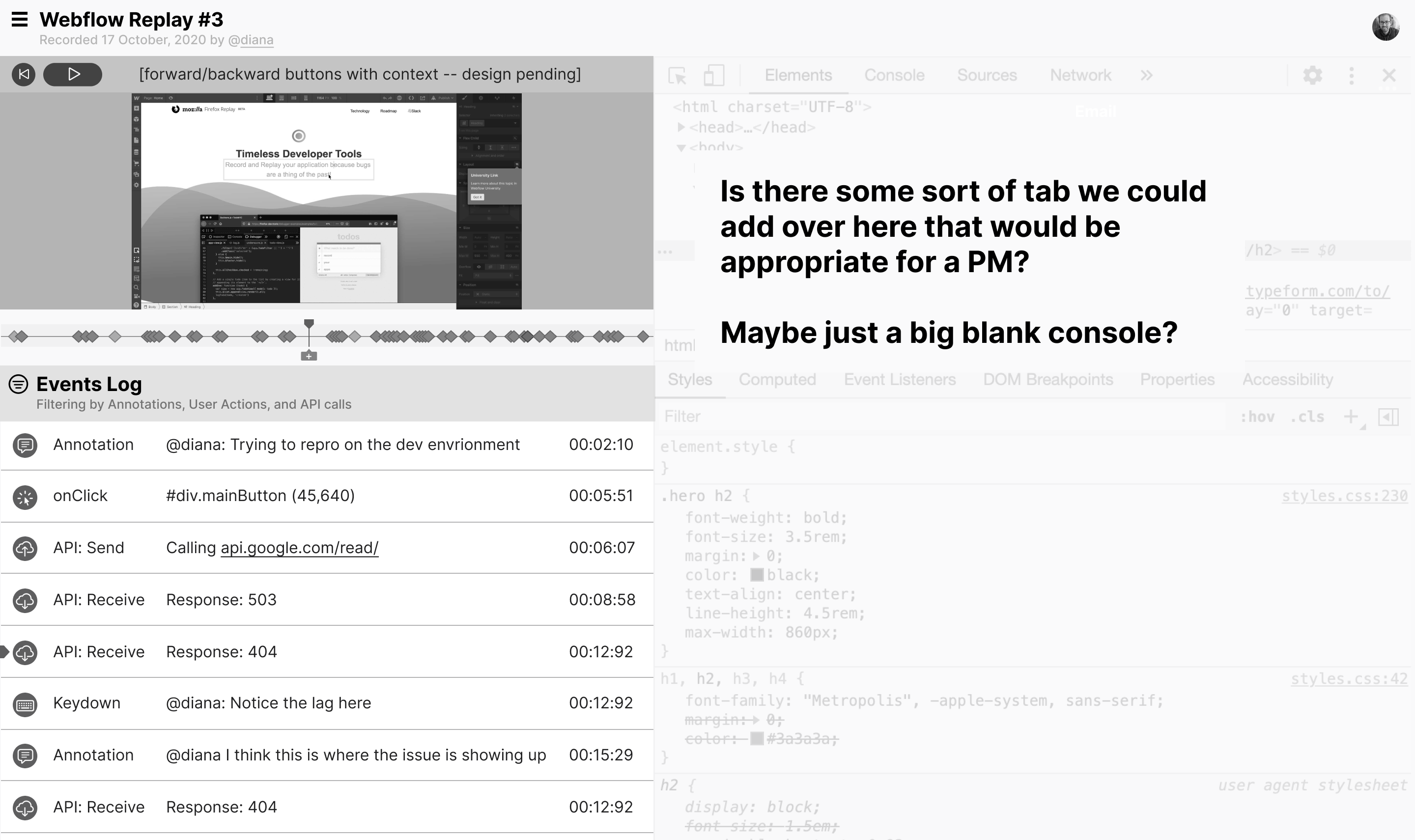
Caption: video, console, comments, and lots of screens of DevTools
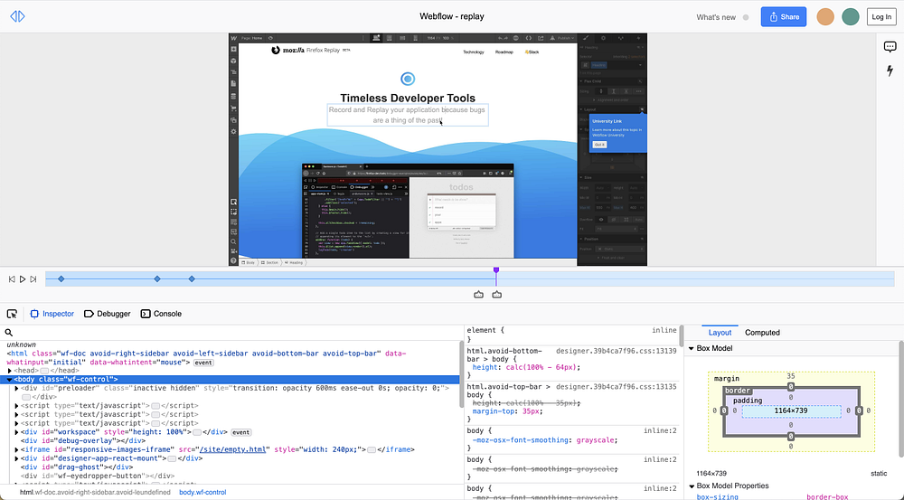
Replay’s been in development for over five years, and the core feature has always been the ability to record software. That means video playback will always be central to the experience, as will standard DevTools for investigating bugs. So our first challenge was figuring out how to put everything together in an approachable but powerful way.
So here’s how things looked one year ago, in November 2020. A video player on the top, a timeline in the middle, and familiar DevTools along the bottom in a three column layout. Notice the comments and lightning bolt pinned on the right-hand side, and the three items on the bottom. That meant we had five panels of content that could be shown or hidden.
Showing more, showing less
Not everything is equally important in an interface. In this early exploration, we tried tucking things away in the header, aligning things left, and bringing comments to the forefront.
But things still felt very busy for non-technical people. Developers often need to “pop the hood,” but what about designers and product managers? We were concerned that this design would be too overwhelming, an insight solidly backed up by our user research. It was too much.
So we did some explorations:
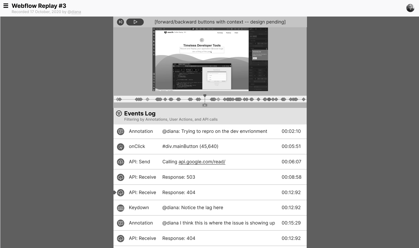
In these, we were playing with the idea of an “events log” where we’d show mouse clicks and keystrokes. The thinking was that we could tuck the professional-grade tools away, but that mouse clicks and keystrokes would be the sort of thing everyone could gain value from.
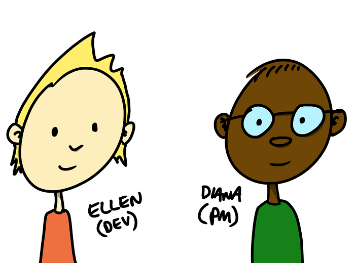
Introducing Ellen and Diana
We did a lot of user interviews. I’m used to 6–10 interviews being the sweet spot, because more than that and you probably aren’t learning much new. That’s not what happened with Replay. We interviewed about 200 people! (Here’s an article we wrote when the number was around 150)
As we processed through the data, it was clear that we had a lot of “Dianas” and a lot of “Ellens,” or in other words, “product managers” and “developers.” And they wanted different things, so we found ourselves saying “For the Diana view, we need this feature” or “Ellen needs such and such feature to be in lights.”
So at a whim, we tried making two interfaces with a toggle. Instead of trying to please everyone with one interface, should we just make two tailor-made interfaces? It turns out yes, that was exactly what we needed to do.
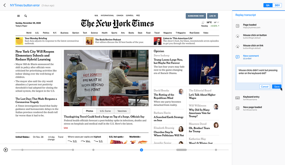
The Toggle Breakthrough
Notice the “QA” and “DEV” toggle on the top right. It felt really good to see how focused the page could be when DevTools were tucked away.
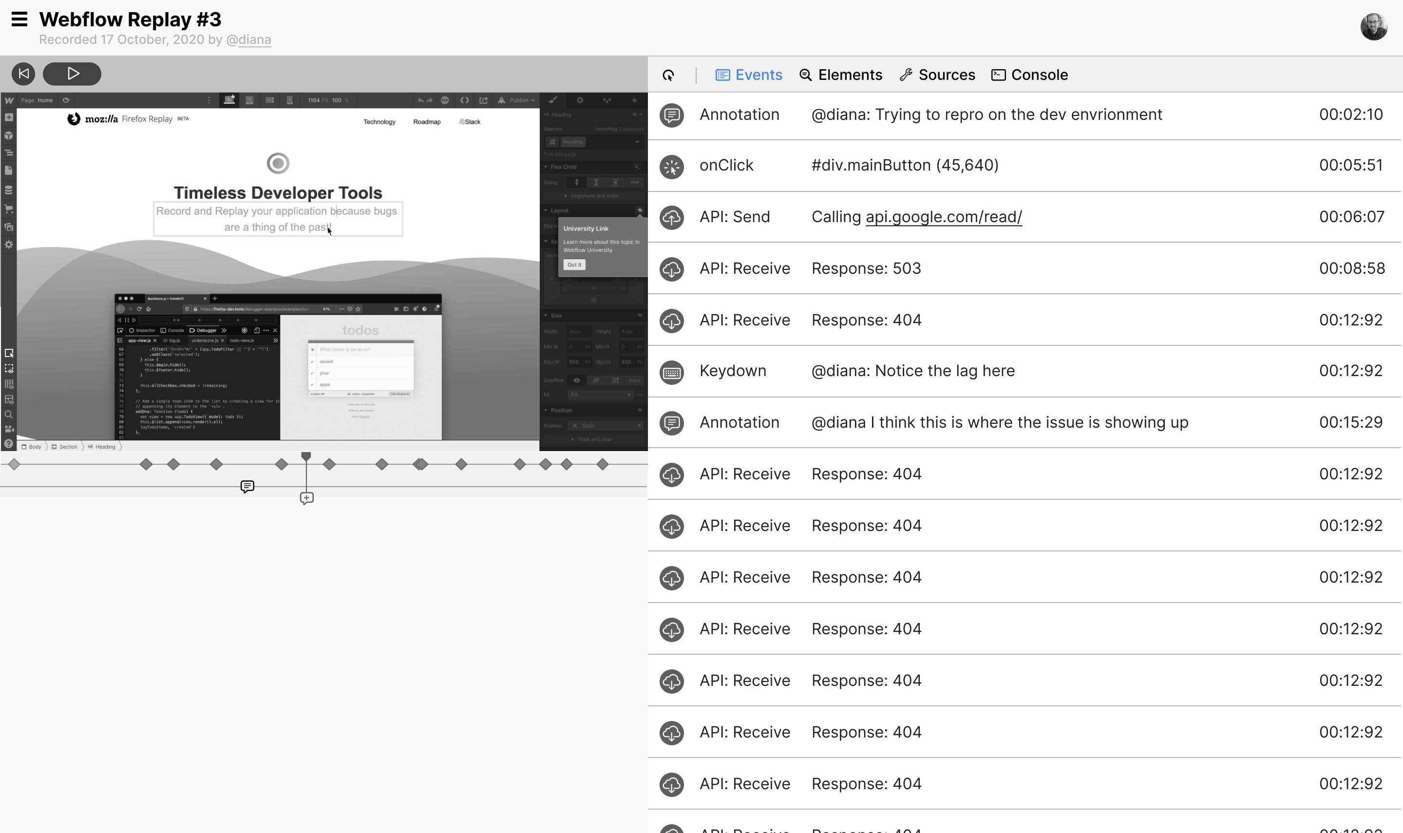
Our “QA” mode
But would that mean our DevTools mode would be too busy? Actually, there’s a fine line between making something “approachable” and “dumbed down.” We quite liked the professional-grade tools we were able to provide access to here.
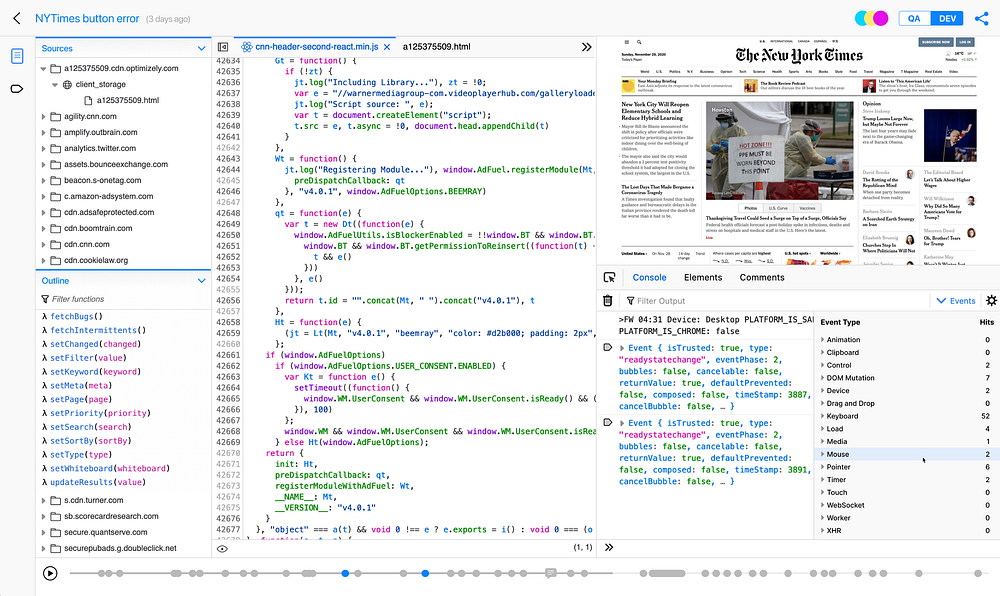
One of the most important design lessons I’ve ever learned is that simple, easy, and good are three different metrics. It’s possible to make something simple and yet hard to use. Especially when you’re dealing with professional-grade software.
Developers, imagine if Chrome removed the console from DevTools. It might be simpler, since it would be one fewer thing to deal with, but it would be much, much worse. You need your console!
“Make each pane do one thing well”
As we iterated, things started to feel more tight and clear, but this screen bothered us. Notice the wall of Mouse Clicks on the left with a single comment in the middle. This screen confused users because we were trying to combine too many things. There was no clear mental model.
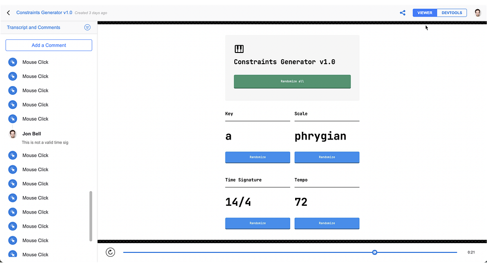
So the design was refined to let that pane do exactly one thing: comments. And that was a much clearer design, because it offered a clearer mental model. Doesn’t this feel nicer? (Other than the eyeliner-pencil thick text boldness. We fixed that shortly after this screenshot :)
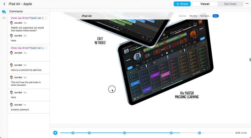
What we shipped with
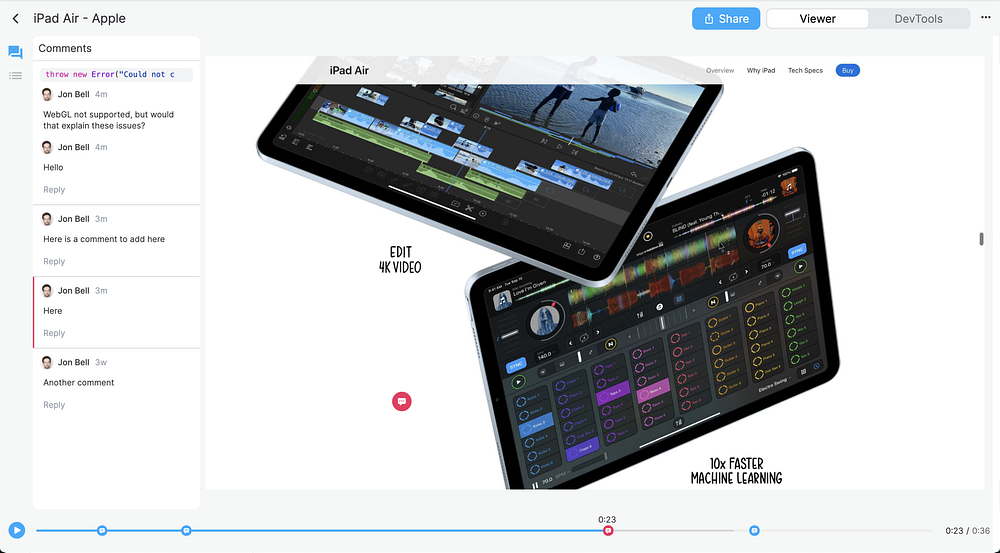
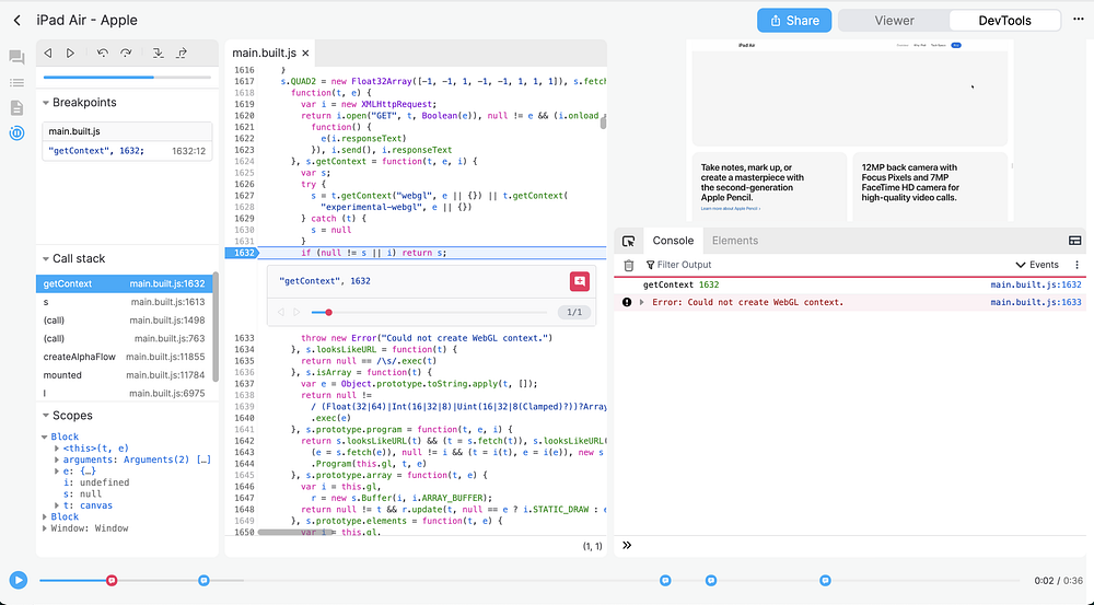
We shipped about two months ago with a much-improved design. The “Viewer” part of the toggle is really good at being a viewer, and the “DevTools” part of the toggle is really good at DevTools.
Viewer, with just enough interface to get your job done and get on with itDevTools, with all the power developers need to fix bugs
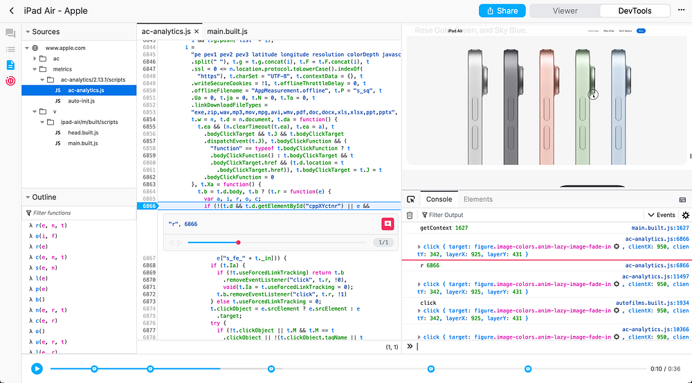
Project “Let the UI Breathe”
You know how launches can be. You’re busy just getting the product out the door, so you can’t get to every last thing you wanted to. And we’ve long wanted our interface to feel more airy and light rather than feeling boxy and spreadsheet-like. So we recently rolled out some nice visual improvements. Same overall layout, but now with more room to breathe:
ViewerDevTools
Onward!
But of course we have more work to do. There are small annoyances like the gray background not extending all the way to the edge, which we’ve filed in a bug. There are larger user journey issues, like helping the DevTools be more approachable. There are a tremendous number of behind-the-scenes improvements that, if we’re doing our jobs right, you’ll never even notice. You’ll just know the product feels great.
And that’s the joy of software design. There’s a Steve Jobs quote that I can’t track down, but I’ll paraphrase. He says something like “that’s what I love about software. If you do a good enough job, and sell enough product, you get to come to work the next day and try to do even better.”
Do your best, see how it’s received, iterate, and move on again. That’s the flow the Replay product team is in now, and it’s so much fun. Onward! 🚀