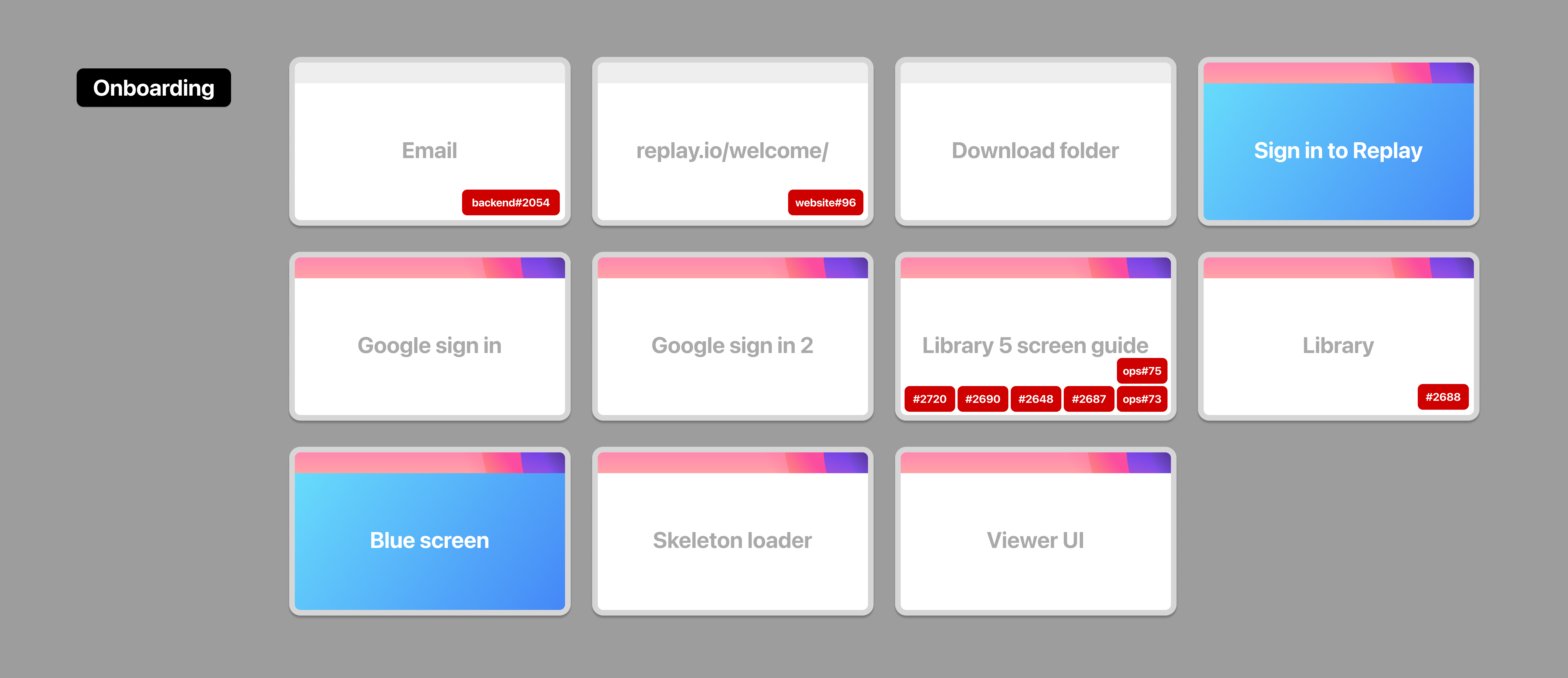
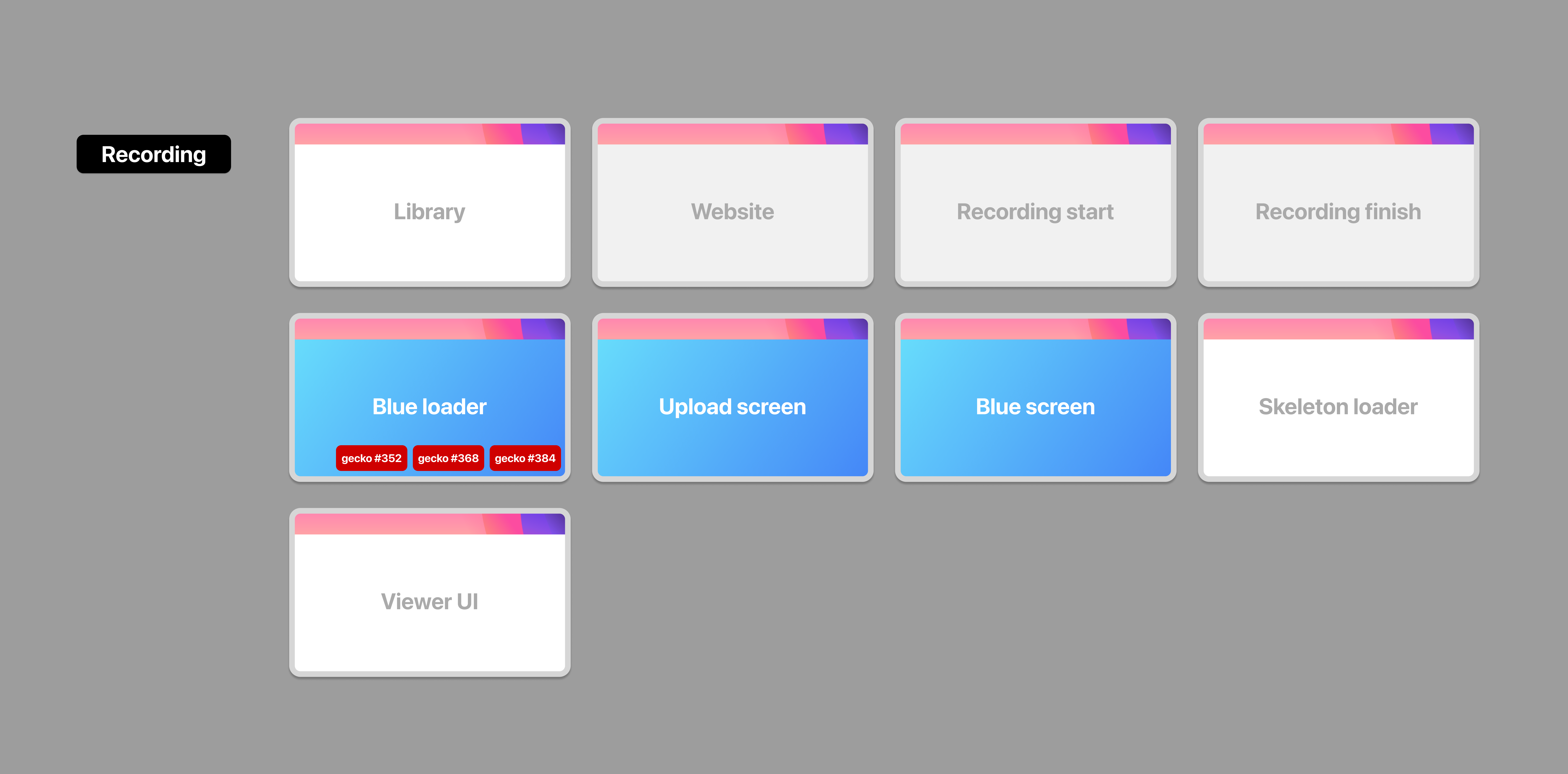
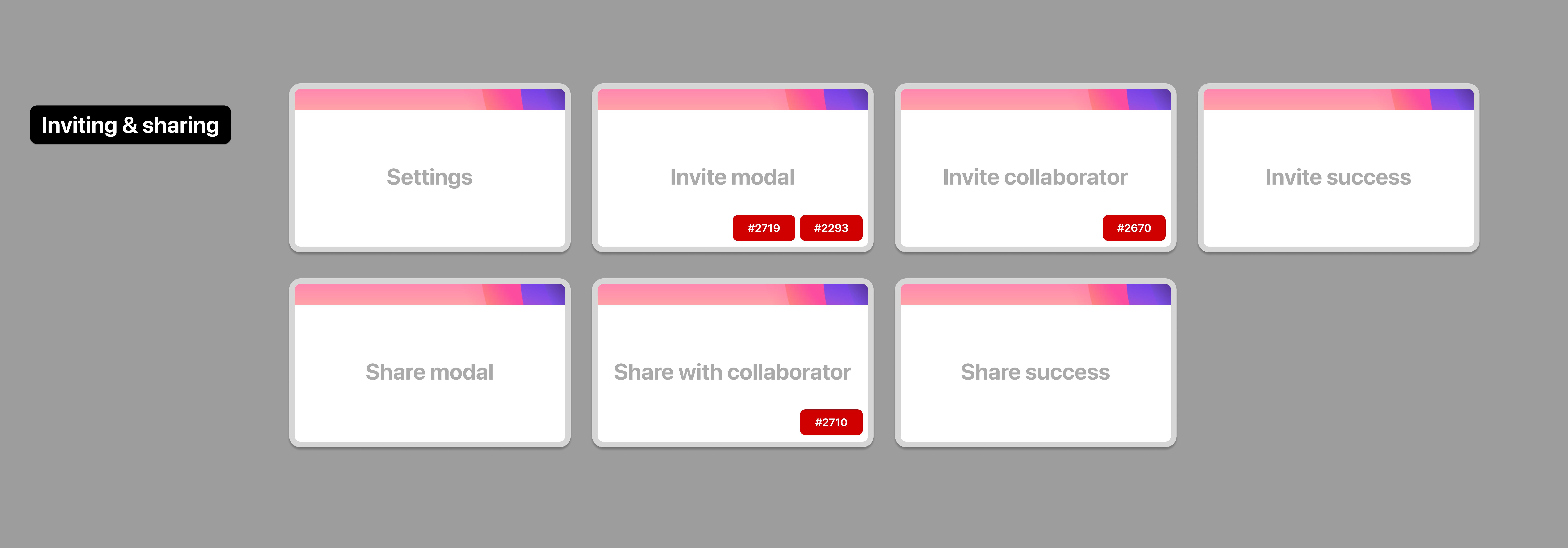
As I mentioned in this week’s changelog, my startup is spending a lot of time on “onboarding,” the UX term for welcoming someone to your product. Our onboarding design has to handle a fair bit of complexity. First, we have two products, a browser and a web-based experience. We have to figure out what to do if someone is logged in or logged out. We need to think about how to invite other people to something you’re working on. It’s complex!
I find it can be helpful to map everything out. Some folks like to make a sprawling flow chart: Is user logged in? Follow this arrow. Not logged in? Follow this other arrow. Flow charts are great in some situations, but at this stage in the process I find them too hard to read and discuss as a team. Instead, I break each common use case into groups, and use simple “cards” to represent each screen.
Next, I like to track where we’re spending our time. In these screens, each red capsule refers to a bug or feature we’re currently tracking. For example, our Library screen needs a new button so we’ve filed it here. Once it’s addressed I’ll take it away from the images below. The goal is to address all red capsules, leaving us with a wonderful onboarding experience.
So here’s where we currently are in terms of onboarding quality. Lots and lots of red capsules to address, so I should get back to it!


First time hearing about this? We’re making a time-traveling debugger to help busy teams reproduce and fix bugs faster. Learn more at Replay.io.


