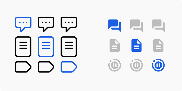
Old icons on the left, new icons on the right
The short version
At Replay.io, we’re designing a tool that lets you record websites, add annotations to the recording, and debug issues. Our product has three icons as part of our devtools that refer to Comments, Source Explorer, and Pause Information. We recently updated them from the icons on the left to the icons on the right. Much better, eh?
So that’s the short version. Read on for the long version.
Design at a startup
We’re a small team and I’m the only designer. A lot of my job is making sure I’m not blocking our developers, so I don’t usually have the luxury to make something perfect. So several months ago I went looking for free icons to use in our product, so I turned to an old favourite: Apple’s SF Symbols app.
SF Symbols to the rescue!
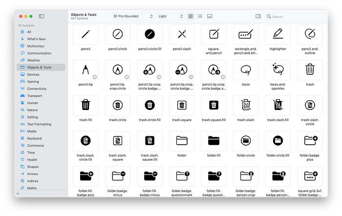
SF Symbols
SF Symbols is pretty great for iOS development. It’s a huge collection of free icons that are designed to work alongside Apple’s San Francisco font. As a product designer, you don’t just get free icons, you also get a whole bunch of accessibility features too. For example, if someone’s font weight is set to bold on their phone, the icons automatically get thicker too for increased readability. It’s super nice.
So I got some fonts from Apple, customised them for use with Replay, and moved onto my next pressing design task. Sorted, right? Well, no.
Oh snap, SF Symbols doesn’t work on web
It turns out, using SF Symbols on the web is a pain. My co-worker and front-end partner was pulling my symbols out of the fonts, converting them to SVG, tweaking them to match other icons, then uploading them into our source code. Which wasn’t going to work. So we set to work finding something better. Something more web-oriented. Something like…
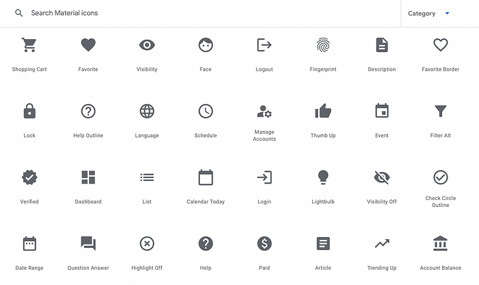
Ok, Material icons to the rescue!
I was so used to SF Symbols that I forgot about Google’s amazing Material Icons website. Not only are there a bunch of free icons, they also come with a lot of different weights and variations, and are designed with accessibility in mind. Perfect!
How to use an icon
We found an icon we liked called “question_answer,” and were pleased to learn that all we had to do in the code was write this:
plain text<span class="material-icons">
question_answer
</span>
And then we found another icon called “description” which was as easy as typing this. Easy!
plain text<span class="material-icons">
description
</span>
Why the other icons were bad
Here’s how the old icons looked in our product. Three vertical icons on the left for three different areas:
We could talk about several reasons the old icons aren’t very good, but the main issue is that they have different heights, which is as bad as a musician that can’t keep a beat. If you compare the old icons to the new ones in a horizontal layout, you can see how sloppy they used to be, and how nice the new ones are.

The old icons had different heights, the new ones are perfect squares
Picking the right icon for “Pause Information”
The third icon has a bunch of information useful for debugging code, so picking the right icon can be a challenge. Our old icon was the outline of a “breakpoint,” something used in debugging. But Material has no breakpoint icon, so I spent some time in the Materal icon search engine to find something we could use. I presented these options to the team:
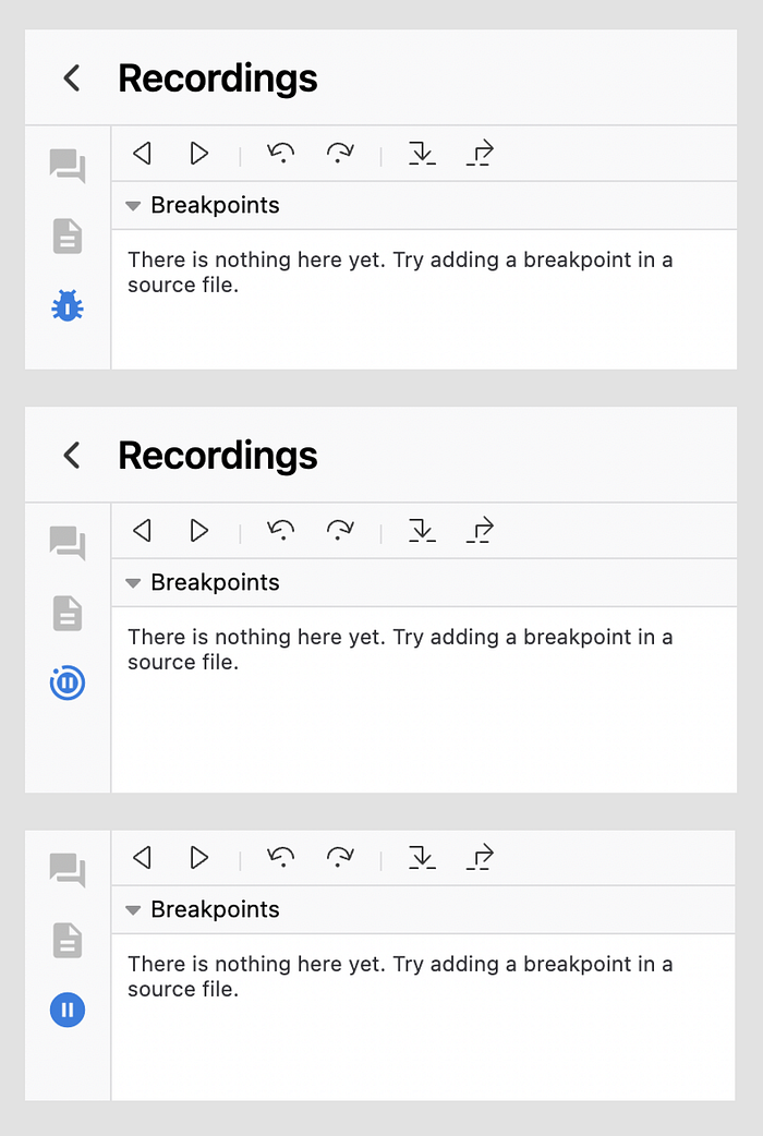
A literal bug, a pause with a little circle, and a literal pause
The results were unanimous: the bug is too negative, and the pause icon isn’t clear enough. But the middle one, the pause with a circle around it, was a big hit with the team. So I just had to write this little line of code to change it.
plain text<span class="material-icons">
motion_photos_paused
</span>
“Design rationale” articles
And that’s the longer story of how we went from a regrettably awful set of icons to ones that look better, act better, are more accessible, easier to implement, and are more clear. It can take a lot of effort to do something that seems obvious in hindsight.
I love reading articles like this. I think there are enough people on the internet saying “we did this” but not enough teams saying “This is why we did this. This was the rationale. These are the tradeoffs we faced.” There’s a lot of great content in those sorts of posts, so we’re looking forward to sharing more of these as we go. Stay tuned!