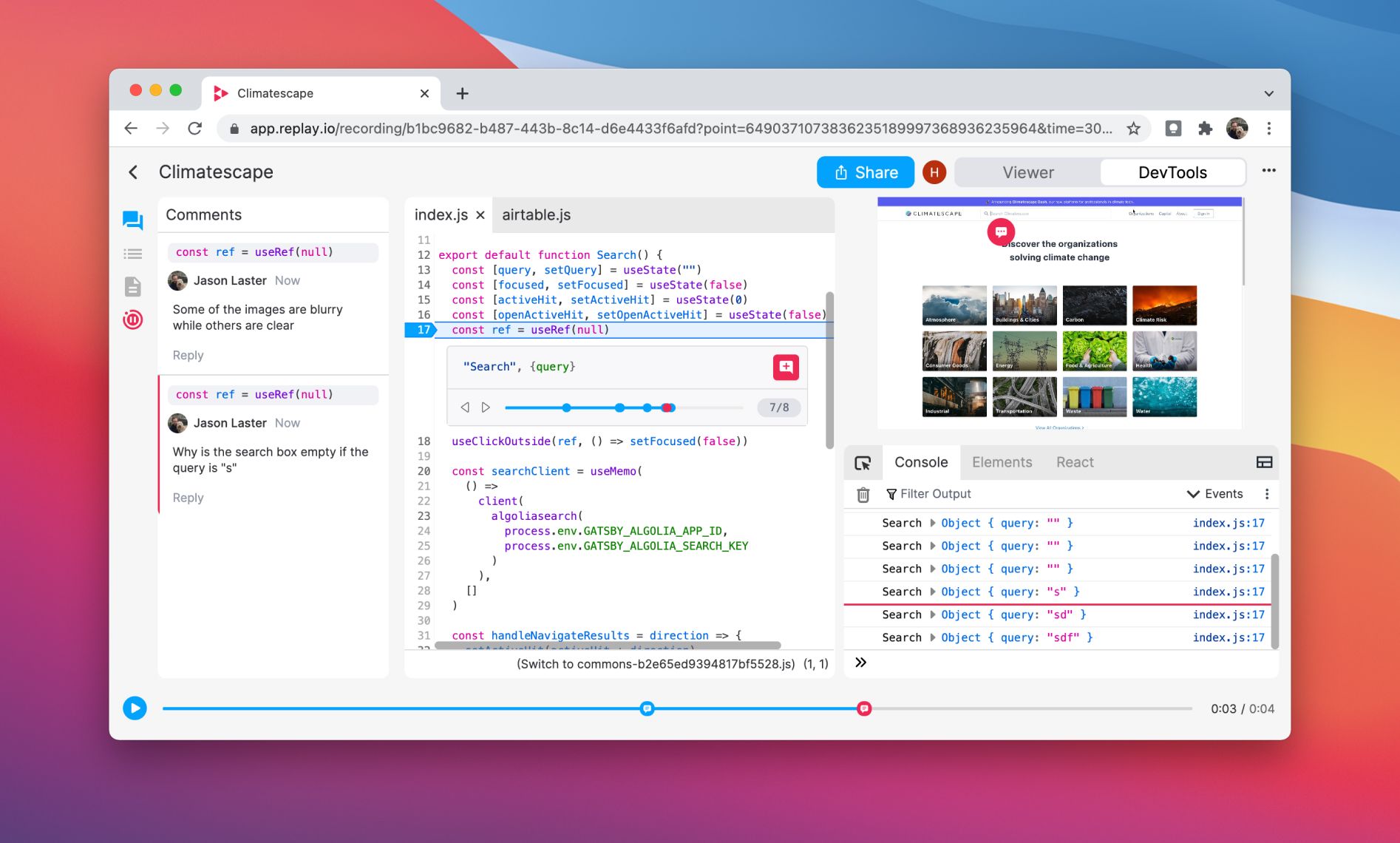
We began refreshing Replay's UI last week. It's now easier to leave comments in the code and follow conversations in the sidebar. We also applied a new whimsical coat of paint.
Why refresh the colors? We believe that we're most creative when we're in a state of play. We are named Replay after all. 💃 Sure Replay is helpful for fixing bugs faster in the same way that time-travel is great for crime-fighting, but Replay is so much more than that too.
Replay is about the joy of connecting the dots faster, exploring the unknown, and learning how things work. We primarily achieve this by making print statements incredibly fast, but we also believe that how you present yourself is important as well. 🙂
Additional Improvements
- DevTools layout: It is now possible to hide the Editor and Video Player as well as resize the left sidebar.
- Symbols values: Symbol values now appear in object previews in the the Console, Inline Preview, and Scopes Pane.
- Event listener counts: Event listener counts are now 10x faster which speeds up start times considerably.
- Console command history: The up and down arrows now cycle through previous console commands in the terminal.
Case Study
Last week we talked with some folks on the Databricks team about their Notebooks. Here's a quick run through on how Notebooks work under the hood.
